The first thing I want to say is that data display was lots of fun!
So my last blog post finished after I had developed and played around with my propositions before moving onto data display.
Miles et al (2014) dedicates 6 chapters to data display (part 2 of their book). I read and re-read these chapters a number of times before I could get my head around everything. Had I not done this, I can see how I may have gone down an inappropriate avenue. Miles et al provide various suggestions along with some smashing examples about how data can be displayed – mainly though matrices and network displays.
For my study, I created matrices (with defined rows and columns). Miles et al describe matric construction as “a creative yet systematic tasks that furthers your understanding of the substance and meaning of your database” (p.113). A key point that resonated with me was that it’s not about building correct matrices – it’s about building ones that will help give answers to the questions you’re asking. To do this, they advise us to “adapt and invest formats that will serve you best” (p.114).
An important conclusion I came to? I didn’t need to use (or fully understand) all the matrices/network displays. I took what I needed to (role-ordered matrices) and combined it with a little of something else (Framework matrices) to allow me to display my data in a way that helped me move on with analysis and progress through to interpretation – always with my research questions at the forefront of my mind (and pinned to my office door).
So here’s what I did: I created a matrix for each main theme (n=4) and each focus group (n=15). In total I created 60 matrices.
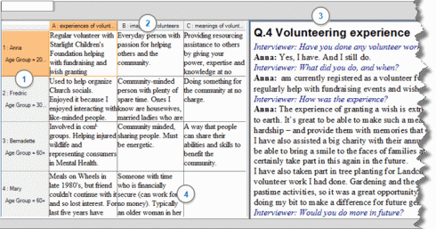
My participants were entered along the first row and within each participant cell I also identified key demographic characteristics. Each subtheme was a column heading. I can’t provide an example of one of my matrices in NVivo as the data is legible, so the image below is a QSR example from their volunteering study.
 The beauty (and massive time saver) of NVivo is that when you click in each cell (number 4 ), the data that you have coded (for the individual within that theme) is displayed on the right of your matrix (number 3). This is referred to as the ‘associated view’. Obviously when you first create your matrix all the cells in the middle will be empty so from the coded data (associated view) a summary needs to be entered into each cell.
For my study, I read through all my coded data and my summaries were developed using the following:
- Including sufficient detail that was understandable and not overly cryptic
- Retaining my participants language
- Sometimes including short verbatim excerpts if I thought it was necessary. All quotes were kept in italics
- Including my commentaries (in a different colour) about context and focus group interaction
A simple, but important thing I noted when writing my summaries is that not all cells were coded, therefore no summary was required. I always wrote ‘NC’ in those cells so I knew that cells were not empty due to an unintended oversight.
Not surprisingly, as with all stages of data analysis, this process was extremely time consuming. However, by the time I completed it, I had so much more insight into what my data was telling me – for example, the similarities, the differences, the unsurprising and the surprising. I generally gained a much deeper understanding of what was going on.
However, it didn’t end there. I wanted to compare and contrast my data not only within focus groups, but between focus groups. This I found difficult on a computer screen as I had to jump back and forth across so many matrices. So….. similar to my propositions, I left my PC and went back to flip chart paper. To be honest, it was a nice break from sitting at my PC.
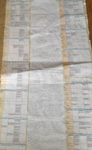
Another beauty of NVivo is that the matrices can be exported into excel. I did this then transferred them again into a word document (I like prettifying my tables with colours etc. and could only do that the way I wanted in word). It cost me a little more time, but nevertheless, it was worth it. I then printed my matrices out (all 60 of them). For each main theme and subthemes I sellotaped 3 flipchart paper sheets together (so that they were long enough to display all 8 focus groups matrices down both sides) and glued my public focus group matrices down the left hand side and my healthcare professionals’ focus group matrices down the right hand side.
These matrices on the flip chat paper then became my focus for a few weeks. I read them, compared them, returned to the literature, returned to my memos, reflected and took time away to think (long dog walks on the beach helped hugely with this). While I did this, I used the white space in the centre of my flipchart paper (between the matrices) to scribble down my thoughts and concepts. For me, this stage enabled the progression from description to interpretation. I even took them to one of my supervision sessions so I could talk through some of my thoughts and illustrate the process I took to get there. I can show you an image of this as the text is not legible – this is one main theme (with 4 subthemes (column headings (in blue)). The peach rows are my participants:
So in a nut shell, my data display process helped me to get my creative thinking underway for interpretation. I then used these matrices to help me write up my first draft of my findings.
I hope this has been helpful. Qualitative data analysis is so diverse and complex and depends upon a number of variables, particularly your methodological approach so there really is no ‘one size fits all’. Please do respond to this post and share your experience of the process you took and how it worked for you. Or did you do something similar to me? 🙂


